Pages

Monday, January 30, 2017

Latest Data Show Weakening Contribution Of Net Exports To GDP Growth


Friday's data release from the Bureau of Economic Analysis shows US GDP growth slowing from a 3.5 percent annual rate in the third quarter to just 1.9 percent in Q4. One factor behind the slowdown deserves a closer look - the declining contribution of net exports to GDP growth. (The usual caveat applies to all the numbers reported in this post. This week's data are "advance" estimates, subject to revision. The average revision of GDP growth from advance to final estimate, without regard to sign, is a substantial 1.1 percentage points.)

The chart shows that the contribution of net exports to growth was positive during the middle years of the recovery, and had just begun to turn positive again after a dip in 2014 and 2015. Because the net export component of growth is volatile from quarter to quarter, I have drawn the chart to highlight the four-quarter moving average, with the actual quarterly data in the background. Whether we look at the quarterly data or the moving average, though, it is clear that the hopeful trend toward stronger net exports was reversed in the last quarter of 2016. . . .

Follow this link to read the full post at SeekingAlpha.com

Friday, January 27, 2017

The Latest Data on Chinese Currency Manipulation Show a Market on the Edge of Instability

 China is a chronic currency manipulator, in the sense that, like the great majority of the world's countries, the People's Bank of China (PBoC) intervenes regularly in foreign exchange markets to influence the exchange rate of the yuan. The US dollar, in contrast, is one of the few currencies whose exchange rate floats freely in response to supply and demand. The fact that China actively intervenes in forex markets while the US does not is a chronic source of friction.   . . .

However, data on China's foreign currency reserves shows that for the past two and a half years, China has been acting as the ally, not the enemy, of those in the US who want to keep the yuan strong. Of course, it has not done this out of concern for American interests, but for its own.   . .

Follow this link to read the full post at SeekingAlpha.com

Wednesday, January 25, 2017

Usual Weekly Earnings For 4th Quarter Show Little Sign Of Tighter Labor Market


How tight is the US labor market? The answer is important to the prospects for accelerated growth in employment and output in the year ahead. If the market is already tight, efforts to create more jobs are likely to push up wages rather than pull in new workers.

The unemployment rate, which fell below 5 percent in the fourth quarter, suggests that the market is already tight. The Federal Reserve estimates that "full employment" (or technically, the Nairu) means a measured unemployment rate of about 4.8 percent, a target already reached. However, data on usual weekly earnings of wage and salary workers, released Tuesday by the Bureau of Labor Statistics, suggests that there is still slack in the labor market.  . . . .

Follow this link to read the full post and view the chart on SeekingAlpha.com

Monday, January 23, 2017

Demographic Dividends Of The Past And Headwinds That Will Shape US Growth In The Trump Era

 One of Donald Trump's signature campaign promises is a 4 percent growth rate for real GDP. During his confirmation hearings, Treasury secretary designate Steven Mnuchin scaled that back to a 3 to 4 percent range, but that is still an ambitious goal. US GDP growth has not reached 4 percent in any year since the start of the century and has not averaged 4 percent over any four-year period since the 1970s.

The new administration is counting on changes in tax rates, trade policy, infrastructure investment, and the burden of federal regulation to reach its growth targets. Assessing the effects of those policies would be speculative at this point, as they exist only in outline. One thing we can be fairly sure about, though, is the demographic environment that the Trump administration faces. Let's look at some of the key demographic dividends that boosted growth in the past and at the headwinds the American economy will face over the next eight years.   .   .  .

Follow this link to read the full post on SeekingAlpha.com

Sunday, January 22, 2017

The Progressive Case for Abolishing the Corporate Income Tax

Reform of the corporate income tax is shaping up to be one of the big issues facing Congress in 2017. Republicans are pushing for big cuts in the corporate tax rate. Most observers seem to assume that conservatives and progressives will be at swords points over those cuts, but they should not be. There is a strong progressive case for sharply lowering the corporate income tax, or better still, abolishing it altogether.

On the Republican side, President Elect Donald Trump has proposed lowering the top corporate tax rate from its current 35 percent to 15 percent while eliminating most loopholes. House Republicans have proposed a 20 percent top rate, also eliminating some important deductions and preferences.

In the Senate, many Democrats, who retain the power to filibuster tax reform legislation, are digging in their heels against the corporate cuts. Progressive superstar Senator Elizabeth Warren of Massachusetts  is leading the fight. In a recent New York Times op-ed, she wrote, “Congress should increase the share of government revenue generated from taxes on big corporations—permanently.” She points out that in the 1950s, the corporate tax accounted for more than 30 percent of all federal revenue, compared to less than 10 percent today (see chart).


She is wrong. Progressives should stop trying to recreate the glory days of the corporate tax. Instead, they should join forces with conservatives to implement a comprehensive tax reform program that includes deep cuts in the corporate tax, or even its entire elimination. Here are three reasons why.

Saturday, January 21, 2017

How To Interpret Differing Perspectives On Changes In The Price Level


The Bureau of Labor Statistics reported Thursday that the Consumer Price Index for all items rose by 2.1 percent in December from its level in the same month of the previous year. At the same time, the BLS and other agencies reported several other perspectives on rising US price levels. 

The change in the CPI is best understood as a change in the cost of living. As explained here, an increase in the cost of living measures the difficulty of maintaining one's standard of living, based on no change in income. The cost of living is the natural focus of individual consumers.

Other data attempt to measure the rate of inflation. Inflation means a change in the value of the unit of account, the US dollar, in this case. A pure increase in the unit of account would raise all wages and prices by the same amount, resulting in no change in the cost of living. Inflation is the natural focus of monetary policy.  . . .

Follow this link to read the full post at SeekingAlpha.com

Thursday, January 19, 2017

Divergent Unemployment Rates Highlight The Intractable Structural Problems Of The Eurozone


The latest data from the nineteen member countries of the Eurozone show an average unemployment rate of 9.9 percent. That is good news, insofar as unemployment is down from its 2013 peak of 12.1 percent. The bad news is not only how high EZ unemployment still is, but how much the rate varies among member countries.

More than fifty years ago, Robert Mundell, then an economist at the IMF, wrote a classic paper explaining when currency areas can work well and when they cannot. Among other things, he noted that an ideal currency area should have free flows of labor among members, flexible labor markets within each member, and similar exposure of members to economic shocks.

If Mundell's criteria were satisfied, unemployment rates would not vary significantly from one member of a currency union to another. . .
Unfortunately, as the chart shows, the Eurozone falls far short of the ideal. . . .

Follow this link to read the full post at SeekingAlpha.com

Wednesday, January 18, 2017

Part-time Worker Crisis Recedes as Economy Recovers

 Not long ago, America seemed to be facing a crisis of part-time work. CNN Money wrote of a "huge part-time work problem" and a "new normal - a permanently high number of part-timers." Others pointed the finger at Obamacare, which they saw as encouraging employers to cut hours in order to avoid providing healthcare coverage. Fortunately, recent data show that the "crisis" has receded as the economy has recovered. What remains is a more modest picture of structural change that does point to a gradual, long-term shift toward more part-time employment. . . . 

Follow this link to read the complete post on SeekingAlpha.com

Tuesday, January 17, 2017

New Data Show Growing Role Of Occupational Licensing in U.S. Labor Market

Not long ago, America seemed to be facing a crisis of part-time work. CNN Money wrote of a "huge part-time work problem" and a "new normal - a permanently high number of part-timers." Others pointed the finger at Obamacare, which they saw as encouraging employers to cut hours in order to avoid providing healthcare coverage.

Fortunately, recent data on voluntary and involuntary part-time employment show that the "crisis" has receded as the economy has recovered. What remains is a more modest picture of structural change that does point to a gradual, long-term shift toward more part-time employment.  . . .

Follow this link to read the full post and view the chart at SeekingAlpha.com 

Thursday, January 12, 2017

Who Benefits from the Mortgage Interest Deduction?

The mortgage income deduction is America's favorite middle-class tax preference
right? The trouble is, the middle class doesn't really get all that much out of it.


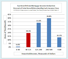
The chart is based on data from a 2016 study by Chenxi Lu and Eric Toder of the Tax Policy Center. Following a definition used in a recent study by the Pew  Research Center, it defines "middle class" as households earning from 67 percent to 200 percent of the median household income, or approximately $40,000 to $125,000 per year. Just under half of all US households fall in that income bracket, but they receive less than a fifth of the tax benefits of the mortgage interest deduction. Higher-income households receive a far larger share.

Several factors reduce the value of the mortgage interest deduction to middle-class households. First, only 21 percent of them claim the deduction at all, either because they do not own a home, because they do not have a mortgage, or because their tax bill is lower if they use the standard deduction instead of itemizing. Second, their income tax rates are lower than those of higher-income households. Third, their homes are worth less, on average.

Putting all of this together, the average middle-class household receives just $191 annually in benefits from the mortgage deduction. In contrast, as the next chart shows, higher-income households, on average, receive benefits of thousands of dollars per year, because more of them claim the deduction, their tax brackets are higher, and their homes are more valuable.


What kind of reforms could potentially correct the inequities of the deduction, both within and between income classes, without raising the overall tax burden on middle-class households or increasing the federal deficit?

Lu and Toder examine two reforms. One would lower the cap on the value of property qualifying for the deduction from $1,000,000 to $500,000. The other would replace the current tax deduction with a flat 15 percent tax credit, which would help all households equally regardless of their tax bracket. They conclude that either of these reforms, or both in combination, would be an improvement over the current system.

An alternative, which I have discussed in detail in a previous post, would be to eliminate the mortgage interest deduction entirely, together with several other federal benefits and tax preferences, and replace them all with a universal basic income. Properly structured, a UBI of that kind would protect the overall after-tax incomes of middle-class families while reducing inequities within and between income classes.


Wednesday, January 11, 2017

Chart of the Day: Modern Misery Index Falls to Pre-Recession Lows

Back in the 1960s, when inflation was soaring while unemployment remained stubbornly high, Arthur Okun invented the "misery index"the sum of inflation plus unemployment. As inflation came under control after the early 1980s, we stopped hearing much about the misery index.

In truth, the misery index is not a bad concept as a rough indicator of the health of the economy. It needs one update, however. In Okun's day, it never occurred to anyone that inflation could be too low. Now, as the experience of Japan, the Eurozone, and to some extent, even the US shows us, deflation can be as much of a threat as inflation.

The Fed recognizes the danger of deflation by setting its inflation target of +2 percent, not at zero. Why not use this target to modernize the misery index? I suggest a "modern misery index" that is equal to the unemployment rate plus the absolute value of the difference between the current inflation rate and the Fed's 2 percent target.

Suppose unemployment is 5 percent. By Okun's old formula, inflation of  3.5 percent would give you a misery index of 8.5, but inflation of 0.5 would give you an index of just 3.5. By modern reasoning, an inflation rate that is a point and a half below the 2 percent target is just as much a source of alarm as one that is a point an a half above, so my modern misery index gives you 5  + 1.5 = 6.5 in both cases.

Here then, is what the modern misery index looks like over the past half-century:

By this standard, the Great Recession still looks pretty miserable, although not quite as bad as the 1970s, when unemployment was even higher and inflation was out of control. Like several other indicators  (see here and here, for example), the modern misery index shows that the US economy has essentially completed its recovery to the best values of the 1990s and early 2000s.


Tuesday, January 10, 2017

How Does the Obama Jobs Record Really Score Against Other Presidents? Let's Be Fair.


As Barack Obama prepares to leave office, there has been a lot of talk about his record of job creation. The raw numbers look pretty  good: Payroll jobs increased by some 11 million from the quarter before Obama’s inauguration to his last full quarter in office. That is the third best among the 12 presidents since World War II, surpassed only by 16 million jobs added under Reagan and 23 million under Clinton.

Not bad. Let’s give credit where credit is due. To be fair, though, the story is more nuanced than told by the headline numbers alone.

Lets start with three points that put the record of the outgoing administration in perspective:

  • Obama was in office for eight years. That made it easy for him to beat the seven presidents who served less than two full terms. It would make more sense to compare Obama’s record only with that of six other eight-year presidencies, counting the shared presidencies of Kennedy/Johnson and Nixon/Ford along with those of Eisenhower, Reagan, Carter, and GW Bush.
  • The population is bigger now. To allow for population growth, we should count the percentage increase in jobs, not the number of new jobs.
  • We should take the state of the economy into account. Other things being equal, a presidency that starts in a slump and ends in a boom is going to find it a lot easier to create jobs than one that starts at full employment or in an unsustainable boom.

Here is my comparison, then. Let’s chart the percentage gain in jobs over eight-year presidencies against the unemployment rate in the quarter before inauguration. That puts the onus of an early-term recession on the preceding president, but assigns credit or blame for the end state of the economy to the president who has been in office for two terms. Here is how that looks:

Monday, January 9, 2017

Chart of the Day: Quits and Layoffs Show Labor Market's Return to Health

The unemployment rate, which stood at 4.7 percent in December 2016, is the most commonly cited indicator of the health of the labor market. The Fed considers an unemployment rate of 4.6 to 4.8 percent to be equivalent to full employment (or, to use the term favored by economists, the non-accelerating-inflation rate of unemloyment.) By that measure, the economy is in good shape.

Some economists, however, consider quits to be an even better measure of labor market health. Quits measure the number of workers each month who voluntarily leave their jobs. Quits fall during a recession because, when new jobs are scarce, few people want to give up a job they have. They rise during times of prosperity, because people are willing to leave their jobs when they think there is a good chance of finding another one.

As the following chart shows, as of October 2016 (the most recent available data), the number of quits had returned to the peak reached before the Great Recession began. Meanwhile, the number of layoffs and discharges had fallen below the prerecession low.


Sunday, January 8, 2017

Chart of the Day: How Badly have Real Wages Stagnated?

It is well known that wages in the United States have stagnated in recent decades, but how badly? We know that nominal wages, expressed in current dollars at the time they are paid, have risen dramatically. In 1965, production and nonsupervisory workers averaged just $2.60 an hour. Now they average nearly $22 an hour. But what really matters is real wages, that is, nominal wages adjusted to show the effect of inflation. Are real wages actually lower now than in the past? Have they increased, but just not very rapidly? As this chart shows, it depends on exactly how you do the inflation adjustment.

Both lines in the chart show the real hourly wages of production and nonsupervisory employees stated in constant 2016 dollars. The red line is adjusted using the consumer price index (CPI) from the Bureau of Labor Statistics. The government uses the CPI to adjust Social Security benefits and the value of the Treasury's inflation adjusted securities (TIPS). The blue line is adjusted using the personal consumption expenditure (PCE) index from the Bureau of Economic Analysis. The Federal Reserve uses the PCE index as the principal indicator of inflation when setting monetary policy.

The difference is dramatic. According to the CPI, real wages have increased just 8 percent in half a century. According to the PCE index, they have increased 40 percent. Even that is not very impressive over such a long period, but 40 percent is a lot better than 8 percent.

If you measure from 1972 instead of 1965, real wages have actually fallen by 4 percent, as measured by the CPI. Even by the PCE, they have increased by just 19 percent.

Which is right? Frustratingly, we can't really say that either measure is right or wrong. The two indexes simply make different choices when it comes to the thorny technical issues that bedevil the measurement of inflationhow to adjust for changes in the basket of goods that consumers purchase, how to adjust for quality, and how to adjust for the substitution of cheaper goods for more expensive ones when relative prices change.

For more on the problems of measuring inflation, see these earlier posts:

What Does the Consumer Price Index Measure? Inflation or the Cost of Living? What's the Difference?   (Also available in a classroom-ready slideshow version). 

Deconstructing Shadowstats: Why is it So Loved by its Followers but Scorned by Economists?


Saturday, January 7, 2017

Chart of the Day: The Output Gap

Potential real GDP is the real output that an economy can produce when it is operating at a level that can be sustained without excessive inflation. Output falls below its potential level during a slump and can temporarily rise above its potential level during a boom.

The output gap is equal to the economy's actual real GDP minus its potential GDP. The gap is negative when the economy is in a slump an positive when it is in a boom. The following chart shows the output gap for the US economy from 2000 to 2016 as a percentage of potential GDP. The chart is based on actual real GDP as reported by the Bureau of Economic Analysis and potential real GDP as estimated by the Congressional Budget Office. (Data for Q4 2016 are the author's own preliminary estimates.)


 Related content: What is the Nairu and Why Does It Matter? An explainer slideshow from Ed Dolan's Econ Blog

Friday, January 6, 2017

Is US Fiscal Policy About to Go Procyclical, Again? How Can We Tell?


As 2017 begins, the US economy is in the middle of a boom, or at least a boomlet. The official unemployment rate is at or below its target level, stock market indicators are hitting all-time highs, and the Fed is starting to get serious about raising interest rates. All this is reflects the expectation of an orgy of tax cutting and infrastructure spending by the incoming Trump administration and a new Republican Congress.  If such a turn in policy comes to pass, will it be a good thing, or too much of a good thing?

Too much, in my opinion.  Republicans like to portray themselves as the party of fiscal responsibility, but their record says otherwise. In practice, GOP budget policy so far this century has been consistently procyclical—expansionary when it should show constraint, contractionary when it should support a weak economy. All signs point to another procyclical episode in the making.

Patterns of Fiscal Policy

To set the stage, here is a little background on patterns of fiscal policythe good, the bad, and the ugly. Economists of all political views show surprisingly broad agreement on the general principles. Good fiscal policy should moderate the business cycle (or at least not make it worse) and should do so in a way that avoids unsustainable increases in public debt. Bad policy amplifies booms and busts. Ugly policy can lead to major crises.

First, some essential  terms and concepts: